From our questionnaire results we were able to gain valid information that could help us develop our initial ideas. We were then able to put these results into pie charts. This allowed us to view quantitative data in a simplistic form so we could analyse our results and then develop our ideas accordingly to our results as it shows what a majority of people look for in a thriller. We used both open and closed questions. The open questions allowed a more detailed qualitative answer to be expressed. This was important as it showed what individuals thought and we were then able to as a group go through ideas we knew our target audience would be interested in.
Questionnaires
From our questionnaire results we were able to gain valid information that could help us develop our initial ideas. We were then able to put these results into pie charts. This allowed us to view quantitative data in a simplistic form so we could analyse our results and then develop our ideas accordingly to our results as it shows what a majority of people look for in a thriller. We used both open and closed questions. The open questions allowed a more detailed qualitative answer to be expressed. This was important as it showed what individuals thought and we were then able to as a group go through ideas we knew our target audience would be interested in.
Fonts
![]() |
Here we've produced different fonts of our title to our thriller. We used the website http://www.dafont.com/ this allowed us to try a variety of fonts which are suitable for a thriller, as you can see we tried different sizes and positions of words. We feel the most effective font is 'tractt' which is the font with the word window in a bigger font, this gives emphasis on the word window and hopes to grab the audiences attention. Our second favourite font is the bottom one this is effective as the end of the letters are pointed, this gives us a sense of danger because it could symbolize a knife. |
Poster Inspirations
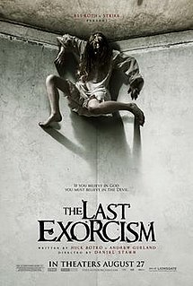
We created a mood board which consisted of a few film posters which we believe were successful when promoting their thrillers. We did this research so that we could develop our potential thriller ideas for our film. We like the composition on the 'Insidious' due to the boys stance and the mystery in his eyes. We also liked the colours projected in 'The Rings' poster, we felt that these dark colours created an uneasy atmosphere. We liked the last exorcism characters costume which influenced us to go out and buy our costumes for our thriller. We liked the concept of the window in the poster for 'The uninvited' thriller. We felt that we should incorporate a window in our own thriller seeming that our thriller is called 'Through The Window'. However we felt that we can include and incorporate ideas from the posters above to assist us in creating our successful poster.
Cape Fear Analysis
Cape fear is a thriller film that was made by Universal, who are very well known for thrillers as they were the company that created the famous film Psycho.
The scene starts off with a shot of rippling murky water. The point of a thriller is to create suspense, the fact that the water is murky creates a fear of the unknown and that the audience can’t see underneath. The shot of the water also gives off the impression that something bad happens that involves the water. The titles used are slanted and distorted which represents the personality of the predator.
Throughout the shot of the water you can see a variety of transitions of blurred images which are relevant throughout the film. The close ups are of a man’s eyes and face which tells the audience that the man has relevance in the film.
As well there is an image of an eagle which signifies prey involved within the film.
The shot changes colour throughout this sequence of images and changes to green with a silhouette of a man, the colour represents jealousy and envy giving off the impression that someone is seeking revenge.
There is a sound sting when Robert De Niro’s name appears on the screen this gives off the impression that he is going to be a main character and also the antagonist.
The non-diegetic sound slowly ends and fades into a mid-shot of a young girl who is perceived to be innocent, shy/timid and this is proven by what she is wearing, the buttoned up shirt shows a sense of impurity and innocence.
The next shot is of a prison cell, the camera pans along the wall where all the pictures on the wall are of dictators, this signifies that they are his role models and shows a sense of power and domination. The close up of the man is of his tattoo on his back which is of the scales of injustice the cross represents Christianity and the scales represents the saying; eye for an eye meaning if someone hurt him he is always going to get revenge.
The final shot is a long shot of the man walking out of prison, in the background you can see a storm brewing which shows bad things are going to happen and represents that he is going to be unstoppable.
Influences
James Hodges.
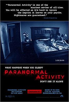
The biggest influence for me was the film paranormal activity, I felt that the way it was all filmed handheld or over CCTV footage (found footage) made it a lot more scary as it feels as if it relates to the audience as its in a real life setting. I found it really effective that everything scary happened at night time and it was predictable as the date/time etc would come up, the audience were then aware something would happen but were left clueless as to what it would be.
Oliver McGregor
Claire Bone
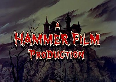
The influence I believe was the greatest when it come to filming our thriller was the production company 'Hammer Film Production' who are famous for the horrors a thrillers that they have been producing. The company, founded in 1934 made most horrors from the 1950's-1980's. This production company is probably the biggest influence towards our group as they absolutely dominated the horror film market in their most successful years. This film companies probably targeted the most audience in their revival films which include 'Let Me In' and the new film starring Daniel Radcliffe 'The Woman In Black'. These two films are probably the most influential to us as they both are horrors which target the audience of 15+.Peter Clare
Subscribe to:
Posts (Atom)