In what ways does your media product use, develop or challenge forms and conventions of real media products?
The title of the film
As our film focuses on the two main antagonists Victoria and Elizabeth, two Victorian girls who had previously been murdered who lived in the house, they take on the role of hurting anyone who dare enters their home because they want revenge on innocent people once like their selves. This is the reason we decided to call the thriller Through The Window as the title creates suspense as the audience are left not knowing what is through the window, this automatically creates tension to the opening of the thriller. Also the title is the very first shot to come up, this is why we decided to use a background which looks like a rundown, old, gritty piece of paper. This again highlights the type of film it is (thriller) and shows the usual conventions of what is to be expected in a thriller film.

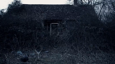
For the setting/location of our thriller we wanted to find somewhere deserted, creepy, eerie and dark. We wanted this as the location as it plays a huge part of how our thriller will come across to the audience. We wanted to be able to create tension, pressure and a nerviness feel for both the characters and the audience and we feel with this derelict house we were definitely able to do so. This establishing shot is one of the very first shots into our thriller. It’s quite a scary image as it’s obvious to see that the property has been deserted for many years and now our 3 protagonists are entering a place which doesn’t seem safe. The overgrown vegetation adds to the uneasy atmosphere.


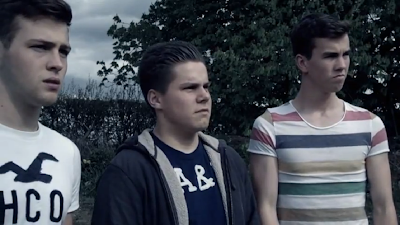
When deciding costumes, as a group we decided on plain white dresses for the girls, we made some fake blood and put it over the dresses to show the girls weren’t maybe as innocent as young girls would seem. Also it suggests that they’ve been abused as their make-up is smeared all down their faces and we can then assume they’ve been crying. We felt this was a common stereotype for young girls in thriller films as when there possessed they usually subvert the stereotype of a normal child. We felt these costumes very much fitted in with the chosen topic. The boys on the other hand, wore casual modern day clothing. They appear normal and it’s easy to identify that they’re the protagonists. We had Pete wearing a brightly coloured striped t-shirt to try and suggest that bright colours symbolize life and purity. Again, demonstrating to the audience that these boys are normal and are only here out of curiosity to see if the location is appropriate to shoot their movie.
When we filmed our thriller we used a variety of different shots to keep the audience interested and concerned to what was going on. We felt this was important as we didn’t want the audience to become bored and uninterested. For the long shot of me and Amy playing ‘ring around the roses’ we used the software Final Cut Pro to make us become more ‘ghost like’. We changed the tone and the brightness of the shot and this made us look more faded, this made the characters look dehumanised and created the idea that we had come from the past. To create this effect and still having the background a brighter colour we first did the shot of me and Amy running around. After, we ran out the shot and then let the camera film for an extra 20seconds. When editing the clips we placed the two shots over one another, and changed the settings of the shot with us in it. This then created the characters to appear faded and ghost like.
Title font and style
When deciding the font the whole group agreed easily on which font was the best out of the 3 fonts we put forward to see which one suited the thriller best. We wanted something that complimented the style we were going for. With this Victorian theme we found that this font suited the thriller perfectly. We were able to find this font easily and it was a quick process to get it onto the thriller. We feel it’s a smart font and this suits the style of the two Victorian girls well. The only problem we found was where to put the fonts to show what names were involved in the making of the film. We wanted to have each name on an individual shot to give importance to each group member, once we’d agreed on where to place the names we all agreed the titles were the finishing touches to the film making it look more professional and it finally looked like a finished product.
Story and how the opening sets it up

The story begins with an establishing shot of the location followed by a mid-shot of the 3 boys talking about how they feel. There is little dialogue so, still the audience are in suspense as there not really able to identify why they are there. We did this purposely to allow the audience to interpret for themselves reasons to why they may be there. Also the audience have no clue to where the house is located, again creating tension of the unknown. Hopefully this interests the audience to want to watch more to find out the answers to the questions.
Genre and how the opening suggests it
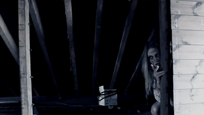
The genre of our film is a thriller; one of the main conventions associated with a thriller is the element of surprise. The group really wanted to make sure we had this in our thriller. We wanted our audience to feel confused and nervous because they didn’t know what was going to happen next. The way we filmed our shots was as though the audience were able to follow the story and get a feel for what the characters couldn’t see at the time. This shot especially demonstrates what our film is, a thriller. This shot showed a quick match on action transition from Pete and Olly to the two possessed girls. A sharp sting was played at the same time as when the girls appear. This hopefully makes the audience jump and makes them aware that the boys are not alone. This helped Indicate what type of film we were offering.
How characters are introduced
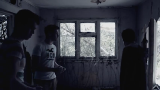
There are 5 characters in the opening to our thriller, we wanted to introduce the three boys first as they were the protagonists and usually in horrors and thrillers the protagonists are introduced first and the element of surprise or horror comes after (the two girls). Each of the boys split up and the camera follows each individual character with Victoria and Elizabeth appearing in each of their frames. Showing to the audience that there not safe. This follows the conventions of a common thriller.
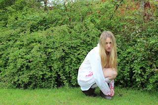
 Both characters are both very silent when in their possessed state which gives a chilling and sinister feeling to the audience as it doesn’t seem normal. Throughout the thrillers both characters show limited expressions showing something isn’t quite right and also shows that the character is detached from reality and what’s happening around them.

